Time for some real talk with an example from another great film — Napoleon Dynamite.
FACT: Bad quality images and design assets reflect poorly on your business and your brand. That’s just the way that it is. We don’t make the rules. We’re just reporting them.
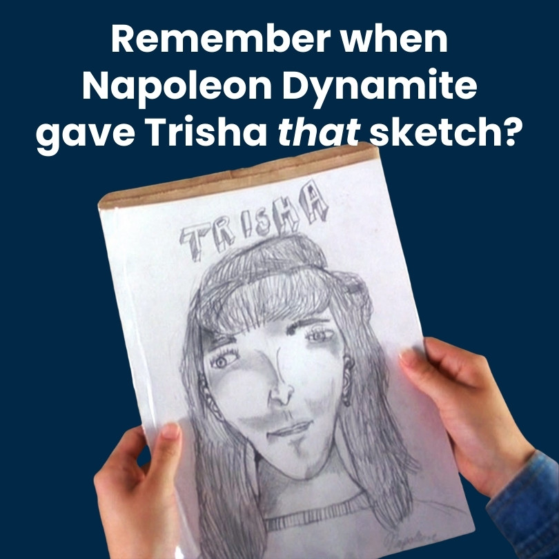


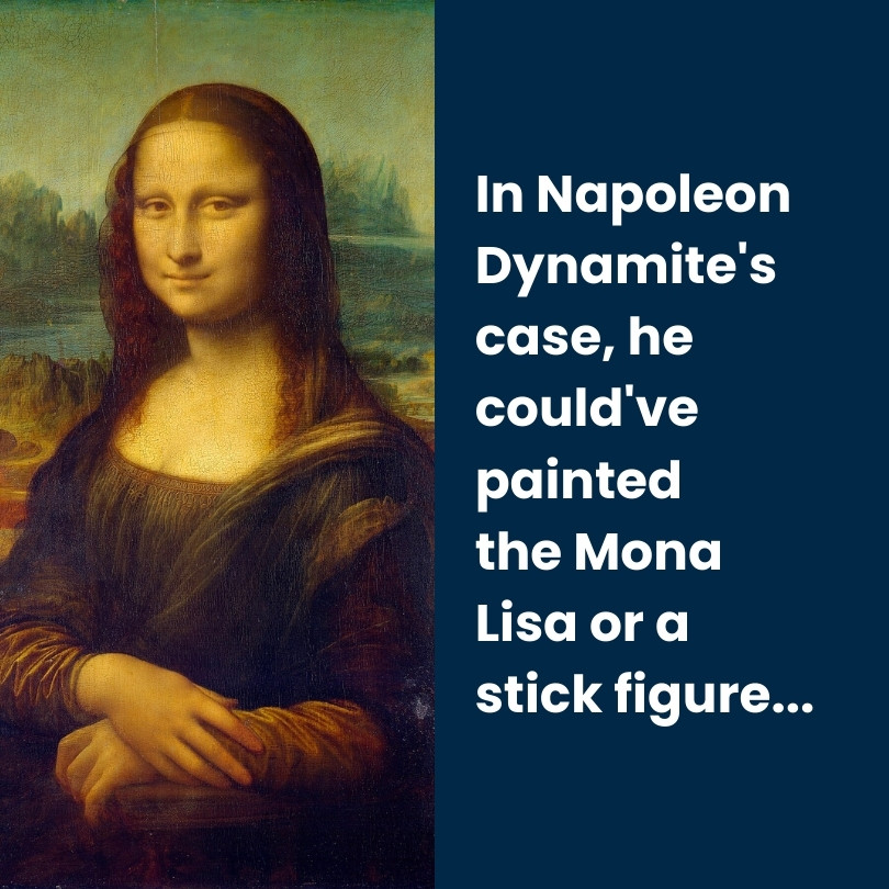

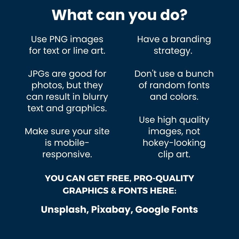
That means don’t pepper your site with generic, low-quality clip art or half-hearted pictures you took on an old smartphone 8 years ago!
By using blurry logos, outdated images, or sad-looking graphics, you are showing your visitors (potential customers!) that you don’t *want to* or *can’t* invest the time to make your site just right!
Why are they going to spend their hard-earned money on your products or services if you don’t want to invest in a high-quality online presence?
You want a modern interface with high quality graphics, clear images, and a well-thought-out structure.
This will be more likely to engage your website visitors and leave them feeling more satisfied when viewing your web content. If they are interested enough on first glance, they are more likely to dig a little deeper into your business or make the conversion from PROSPECT to CUSTOMER
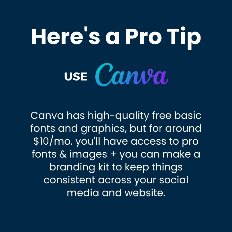
Also, I highly recommend Canva. Their premium plan will allow you to use their professional quality templates and stock graphics and post to social media, all from the same account!


